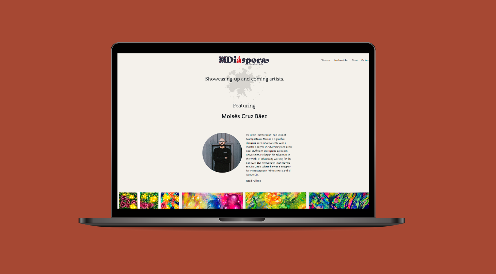
Diaspora is a UX/UI design project that showcases art from underrepresented Puerto Rican artists in a digital gallery. The focus of the project is to create an inclusive and visually engaging platform where users can explore and appreciate diverse artistic perspectives. The design emphasizes accessibility, cultural representation, and seamless navigation, ensuring a user-centered experience that connects people with meaningful art.
Team:
Gabriel Aguayo
Madison Porter
Jennifer Willeck
Timeframe:
3-week sprint
Tools:
Figma
Miro
InVision
Google Drive
Slack
Zoom
Diaspora is derived from the Greek word diaspeirein, meaning “to scatter, spread about". Puerto Ricans use “diaspora” to refer to the emigration en masse of people from the island, who left out of necessity to parts unknown. And that is the concept of this project, to showcase and spread the art of underrepresented artists of Puerto Rico and elsewhere. We want to “spread about” art that speaks to a different canon and create an avenue of growth for emerging artists by opening a path for art lovers to discover their work.
Research & insight
We started off by diving into the trials and tribulations of users seeking unique art. Like: How do they find art? What tools do they use? What's important to them when looking for art?
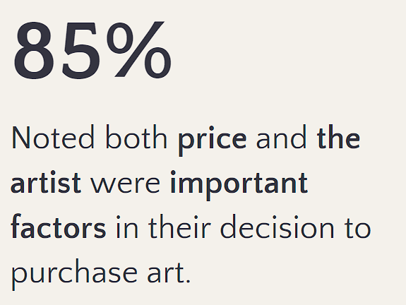
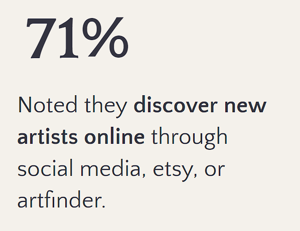
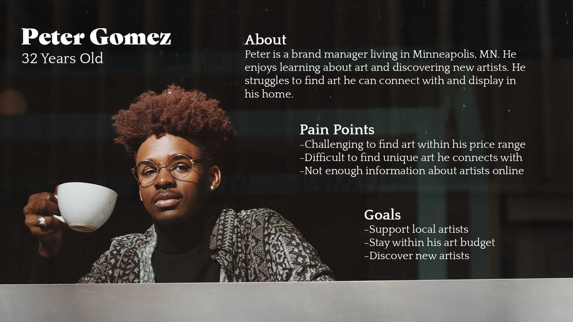
Through a comprehensive survey, we uncovered a significant trend: the majority of users actively discover artists through online platforms and social media. Our in-depth user interviews further highlighted the pivotal role of the artist's identity, fostering a personal connection with the art. Additionally, our survey data underscored the significance of price points, with a consensus among users that the affordability of art purchases is a key consideration in their decision-making process.
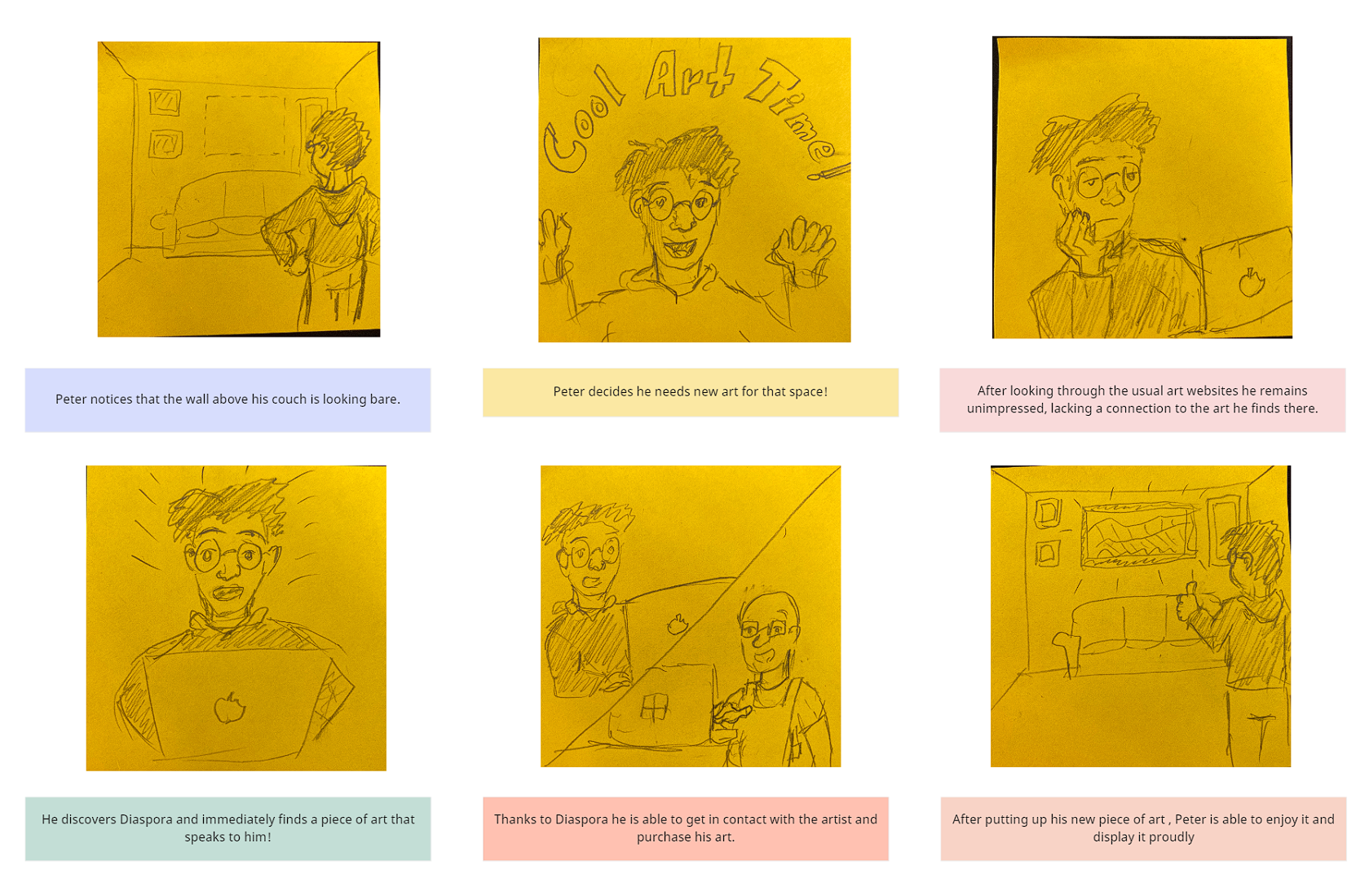
Leveraging insightful data analysis, I meticulously distilled information to craft a compelling User Persona and Storyboard, showcasing my ability to transform complex data into user-centric narratives.
Ideation
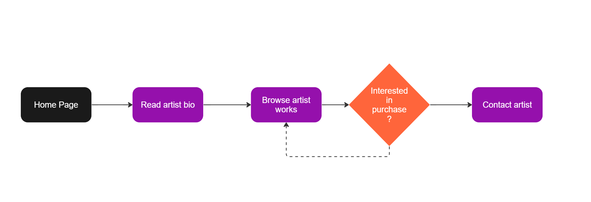
We embarked on a journey of crafting and refining our user flow, embracing iterative processes to enhance the user experience. Keeping simplicity at the forefront, I took the initiative to design the initial user flow.
Through collaborative efforts, we iterated on this foundation, sculpting a more intuitive and seamless user journey.

prototyping & testing
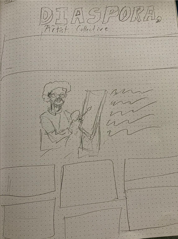
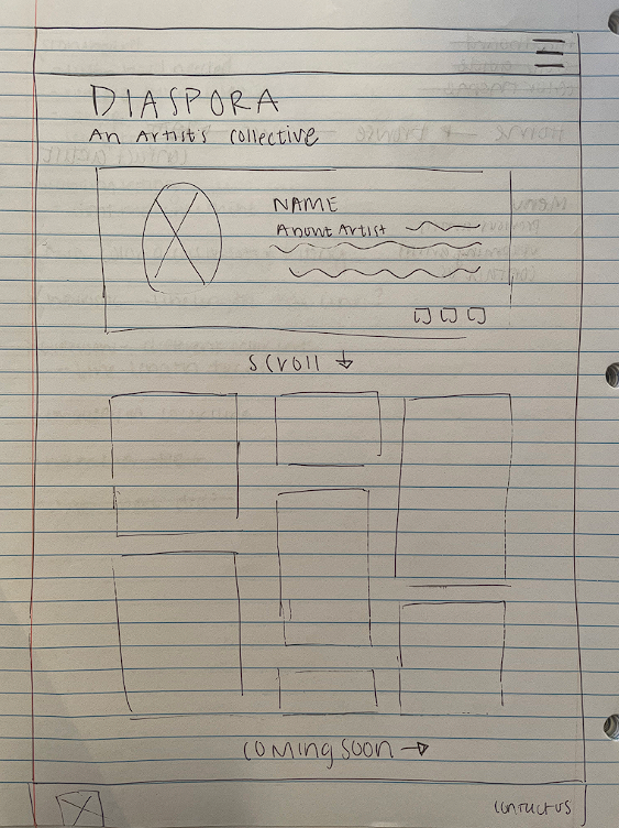
In the early stages of our design process, we employed the timeless technique of pen and paper wireframing to lay the foundation for our digital masterpiece. This hands-on approach allowed us to quickly sketch and iterate on basic visual concepts, fostering creativity and enabling swift ideation. The simplicity of pen and paper wireframes provided a low-fidelity canvas to explore ideas, ensuring a fluid and collaborative design process before diving into more intricate digital prototypes.
User tests pinpointed crucial design challenges: information accessibility, confusion between art image and plus box interactions, and a lack of clarity about the site's purpose. In response, we iterated the prototype, enhancing clickable images, introducing a 'contact artist' link, incorporating a concise mission statement, and implementing hover titles for images, addressing these pain points effectively.
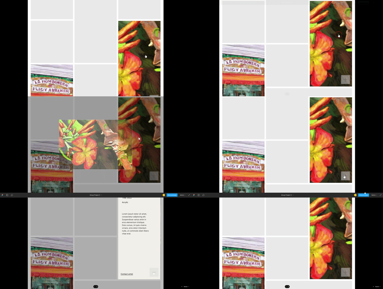
The feedback for our final design was largely positive. Given more time, we would have considered implementing an art history section for educating users on Caribbean art, introducing a 'save favorite' feature, and incorporating an e-commerce functionality to facilitate direct purchases from the artists.